HfG Museum Ulm – structuring design.
Margherita Novembri
The “Hochschule für Gestaltung Ulm”, in Germany, was opened from 1953 until 1968. Despite its short existence, it represented a continuous project of post war of rethinking social sciences rules, inside a beliefs on rational supremacy. HfG Ulm was probably the most significant school of design to come into existence since the end of WWII, not so much for what it achieved in terms of actual production, nor for the large number of designers it effectively educated, but for the extraordinary work it conducted in the study and creation of an effective design method. Since 2011, The HfG-Archiv/Museum Ulm, located in the original building of the academy, documents the changeful story of this famous school. The mission of the museum is to disclose the important work of HfG through its archive and a showcase of artifacts connected to the school.
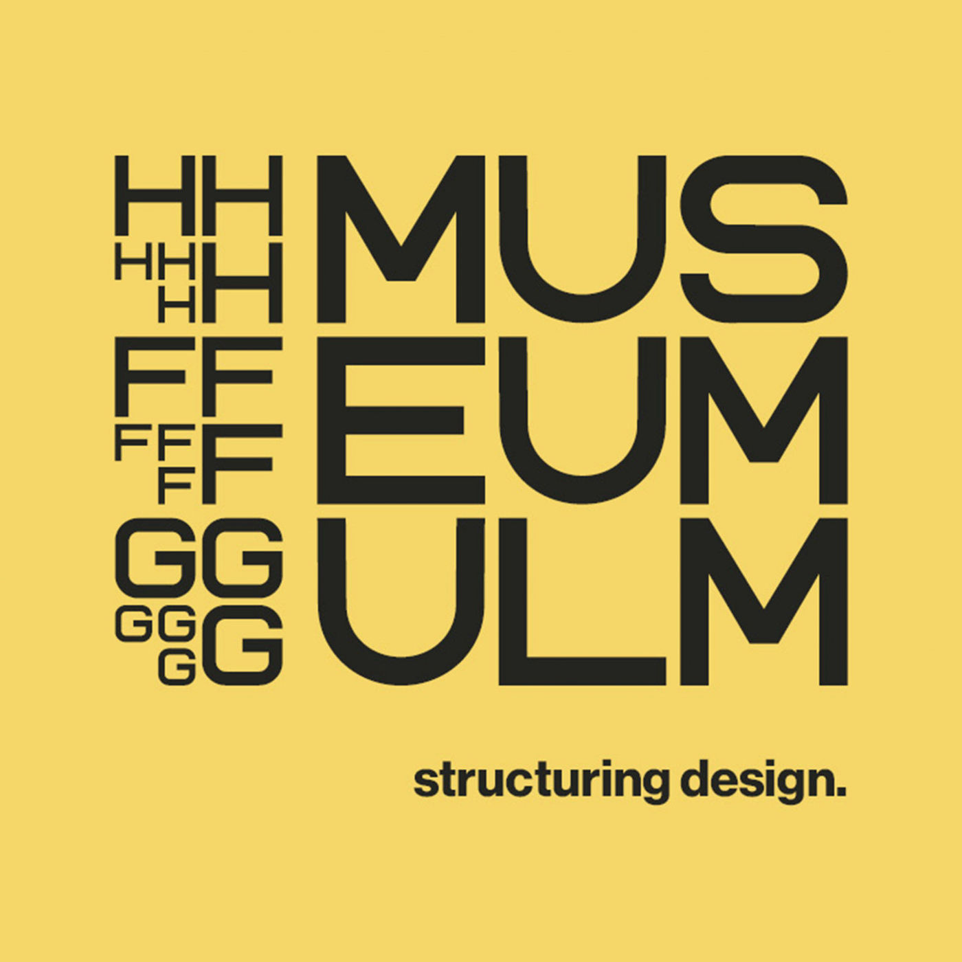
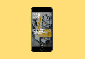
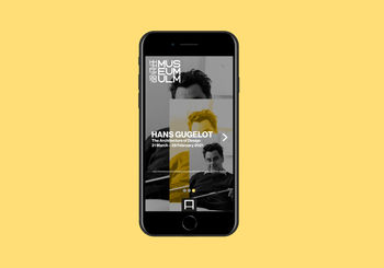
The new Identity of the museum, which changed it’s name into “HfG Museum Ulm”, pursue the same goal. The tagline of the museum attempts to express this. “Structuring Design”, is a sentence inspired by William Huff’s quote: “to design … is first of all to structure”. William Huff was a figure related with the school: first as a student (1956) in the Grundlehre with Maldonado and then as a visiting lecturer for the Grundkurs in 1960. This sentence, from his article “An Argument For Basic Design”, enhances the “method of design” and confirms the importance of HfG contribution to design practice. Furthermore the hole article is an ode to basic design (taught during the Grundkurs) which is itself the first structure to the evolution of the Ulm designer.
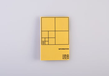
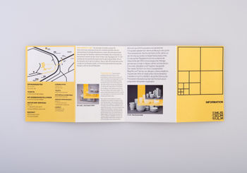
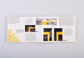
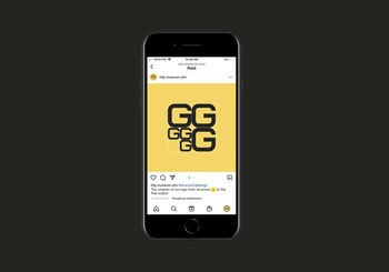
The new identity of the museum is inspired from the graphical and geometrical works conducted at HfG during the Grundkurs, focusing on the work of Maldonado. Being the first step of the new design method, the Grundkurs and in particular this exercises which are at the base of the concept, attempt to represent the museum, and to express the “history of a method”. The concept of the identity relies on the mathematical concept of fractals, such as the Sierpinski Triangle and the Peano Curve exercises by Maldonado, but also in the creation of a grid/pattern as in the raster exercises. This grid/pattern repeats its form in the same way on different scales: is formed by different sized squares one inside the other. It’s the structure of the word mark’s letters which are formed by using the same line module and which repeat in different scales. The word mark’s grid repeats in some parts of the identity (such as the flyer cover or the posters), reinforcing the concept and also representing in a graphical way the tagline of the museum: “Structuring Design”.





Design by Reason


