Corporate Identity – HfG Museum Ulm
Nora Rinner
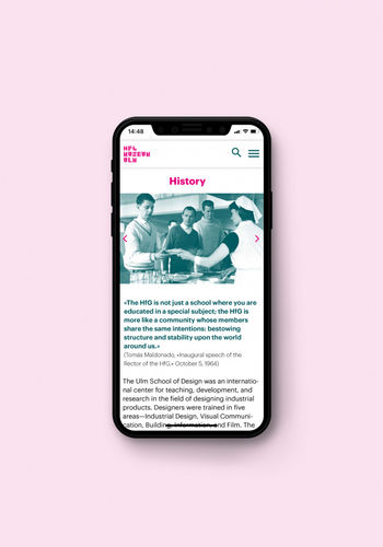
The HfG Archive Ulm has existed since 1987 and has been a department of the Ulm Museum since 1993. In its double function as archive and museum, it follows the aim of documenting the history of the “Hochschule für Gestaltung”, which existed from 1953 to 1968. The history of the school is made accessible to the public through the permanent exhibition “Hochschule für Gestaltung: Von der Stunde Null bis 1968” and special exhibitions such as “Hans Gugelot: Die Architektur des Design”. The HfG Archive has set itself the task of keeping the legacy of the school alive through the exhibitions.
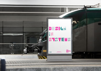
The museum should be a place to discover history, pedagogy and heritage of the HfG. The pedagogy of the HfG was very special, the approach of designing entire “systems” draws international attention to Ulm. This is reflected in the museum’s tagline “Design in systems”. For the new visual identity, the name is changed from ‘HfG Archive Ulm’ to ‘HfG Museum Ulm’.
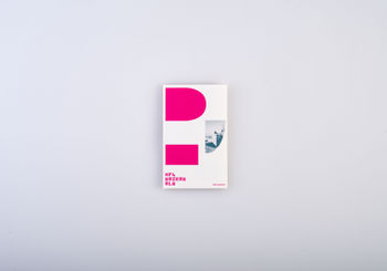
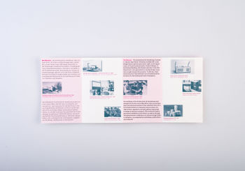
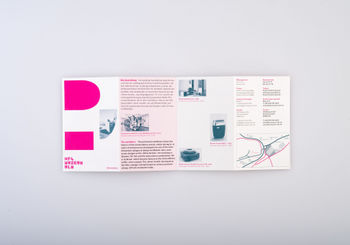
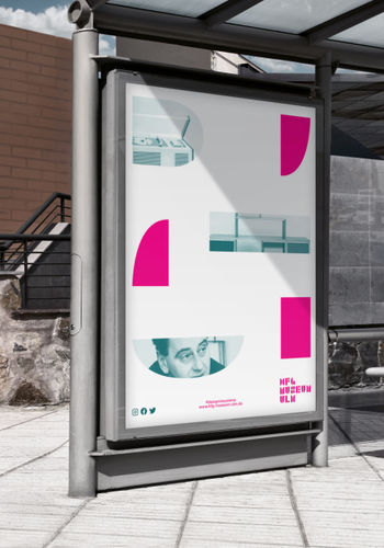
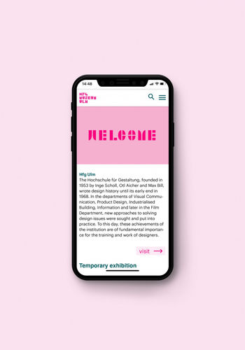
The basic idea of the school to develop a system for complex themes was adopted for the visual identity. The system of the visual identity is based on the mathematical principle of the golden ratio. The primary shapes of the letters are based on a grid of the golden ratio. A further step was to extend it to the rest of the alphabet and numbers that it can be used as a font in other applications of the museum. In addition to the grid in the golden ratio, the imagery is also based on this ratio, as well as the museum’s flyer. The two main colours of the visual identity, green and magenta, are based on the colour theory of Johannes Itten, a former Bauhaus teacher also shortly taught at the HfG in the first years.

Design by Reason


