

A Typeface and its Era - Apple Chancery
Caterina Murari
Student
Caterina Murari Academic staff
Markus Weithas Course
Typography and Graphics – A typeface and its era Program
BA Major Design Semester
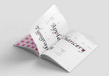
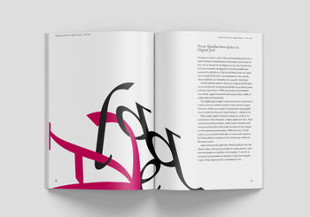
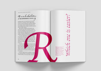
2024/25 SS This Brochure describes the Typeface "Apple Chancery" and its Era. Each chapter captures a different aspect of it. The first chapter talks about the font in general and its founders. The second Chapter analyses the anatomy and shapes of the font, also showcasing some patterns created using letters of the typeface. The other four remaining chapters are based on the era of the 1990s; the period of time in which the typeface was designed. They cover various aspects, such as important events happening around the world, famous and influential personas, art, philosophy, and the architecture of that time.
A project made in the course
Typography and Graphics – A typeface and its era
A Typeface and its era. A research project. Every Font has its story. Characters convey a meta-message in addition to the textual statement due to their formal nature.
More projects by Caterina Murari

Explore related projects

Marwa Charaf
Who really occupies Bolzano when nobody is looking?

Hannah Marlen Zischg
Can you read a street like a book?

Gioele Maines
Com’è cambiata la fotografia attraverso l’evoluzione dei suoi dispositivi?

Leo Alexis Constantin Weissenbacher
Kann Datenschutz existieren, obwohl alle privaten Daten einsehbar sind?

Carmen Anthea Alcaraz Bracho
How much of a place can be understood through sound alone?

Andrea Binanzer
What if the most beautiful part of a garment is how it was made?