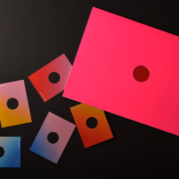
Alaska©®™
Lea Vrabelova
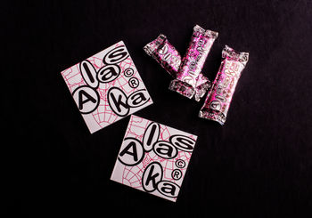
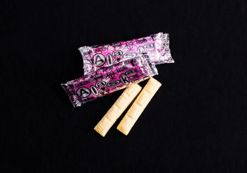
Project Alaska started with the pure idea of redesigning a brand of well known, but not popular snack in Slovakia. Alaska is something we all knew, but would never reach for it in a shop among all the other options with better marketing and advertisement, but not a better price. No even us, customers with gluten-free diet, whose options are quite limited and nearly triple the price of Alaska.
The enthusiasm and welcoming energy of the corn character, bright colors and very bold red logo came very much underappreciated. With same excitement I jumped into this project, which led me through a path contrary to my expectations.
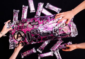
I found out that the happy never existed. Alaska was never a local brand, Alaska was not welcoming. The corn died and uncovered the whole new continent of Alaska, but even when I was digging deep into its origin, it remained a mystery. The only thing that was clear was that Alaska is just a mask for investor, corporations, and many other entrepreneurs with big, round eyes with dollar signs in them. Now we see it performing its role for the audience of us customers. However, in the future, future I probably wont be part of, but imagined. Its mask became the truth and Alaska becomes an honest representation of its creators.
The original is only one. The original is the fake.
Make It Better


